I'm Not a Designer. My Presentations Say Otherwise.
I want to be upfront about something: I have no design ability. None. My spatial reasoning is poor. My color sense is unreliable.
For most of my career, this meant one of two things: either my presentations looked bad, or I paid someone to make them look good. Both of those options are expensive — one costs credibility, the other costs money.
The Design Gap
Here's the thing about the design gap that nobody talks about honestly. It's not just aesthetic. It's functional. A poorly designed slide doesn't just look unprofessional — it communicates less effectively. Your ideas — which might be genuinely good — get filtered through a presentation that signals to the viewer 'this person didn't care enough to make this clear.'
That's not fair. I care enormously. I just can't translate it into visual design.
What Changed When I Started Using Pi
The first time I used Pi, I typed a description of what I needed: a client proposal for a mid-sized retail company, professional but warm, data-forward.
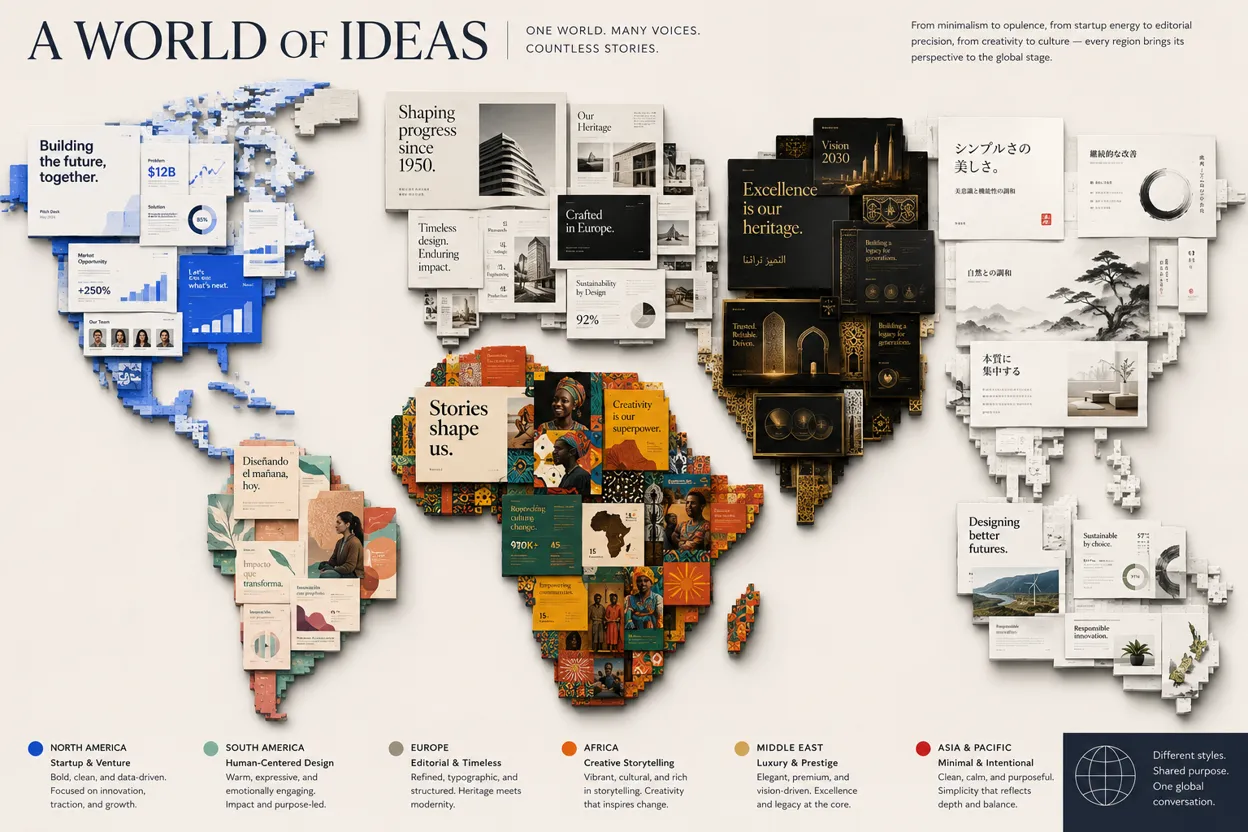
What I got back: clean layout, appropriate use of white space, and a color palette that was coherent rather than random. Charts that communicated rather than just displayed. Typography that had hierarchy — so the reader's eye knew where to go first.
I had never produced anything that looked like that. I had never produced anything even remotely close to that.
The client comment on that proposal was 'this is very well put together.' They weren't talking about the content — the content is what I always bring. They were talking about how it looked. They noticed. It changed how they perceived everything else in the document.
The Specific Things Pi Gets Right That I Never Could
Consistency: every slide in a Pi-generated deck follows the same visual rules. The same font family. The same color logic. The same spacing rhythm. When I built decks manually, slide 7 would look completely different from slide 2 because I made different decisions in different moments. Pi makes one set of decisions and holds to them.
Hierarchy: Pi understands that not all information is equal. Headlines are bigger. Supporting points are smaller. Data is visualised rather than listed. This sounds obvious but it is genuinely difficult to execute consistently when you don't have strong design instincts.
Restraint: this is the one that surprised me most. Pi uses white space. It doesn't cram every pixel with content. It trusts negative space to do work.
What I Do Now
I describe. Pi designs. I edit the content to make it specifically mine. The whole cycle takes a fraction of the time my old process required.
I still can't design. But nobody looking at my work would know that. The gap between what I can describe and what I can execute has closed completely and that's not a small thing.