The Power of Deep Blue: Designing Trustworthy Corporate Presentations

Color shapes perception before an audience reads the first bullet. In a corporate presentation, the palette signals whether the message feels credible, calm, analytical, innovative, or unfinished. That matters in investor meetings, executive briefings, sales conversations, and consulting readouts, where trust is not decoration; it is part of the argument.
Deep blue is one of the most reliable foundations for a corporate presentation color palette because it communicates stability, intelligence, and control. But deep blue alone does not make a deck professional. A navy background with weak contrast, inconsistent accents, or crowded layouts can feel heavy rather than premium. The real value comes from using deep blue as part of a disciplined visual system.
Why Deep Blue Works in Corporate Presentations
Deep blue sits at the intersection of authority and restraint. It feels serious without feeling aggressive, and it supports complex topics without adding visual noise. That makes it especially useful in industries where credibility is central, including finance, SaaS, consulting, enterprise technology, healthcare, manufacturing, and B2B services.
In B2B presentation aesthetics, deep blue often helps a deck feel executive-ready. It suggests that the presenter is prepared, structured, and in control of the conversation. For a pitch deck, it can make a young company feel more grounded. For a sales deck, it can create a confident frame for ROI and value propositions. For a board presentation, it supports a calm, evidence-led tone.
The color does not persuade by itself. It creates the visual environment in which the business case can feel more credible.
Safe Color Choices Are Not Strategic Palettes
Many teams choose dark blue because it feels safe. That is understandable, but “safe” is not the same as strategic. A safe palette avoids obvious mistakes. A strategic palette improves communication.
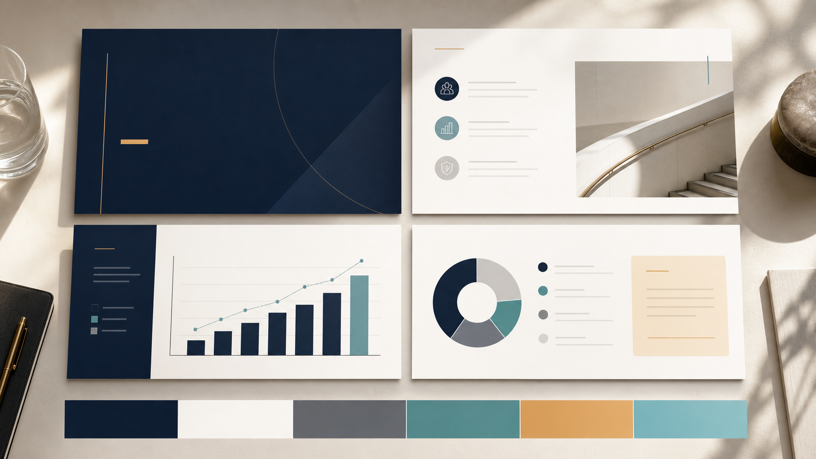
The difference usually appears in four areas: contrast, hierarchy, whitespace, and accent control. A strong deep blue slide design uses dark tones to anchor the message, lighter tones to protect readability, and accents to guide attention. It does not treat every slide as a full navy canvas.
A generic corporate deck may use blue everywhere: backgrounds, icons, charts, dividers, shapes, and callouts. A more polished deck uses deep blue selectively. It alternates dark section openers with light content slides, makes key numbers stand out, and uses whitespace to make the brand feel confident rather than crowded.
How to Build a Corporate Presentation Color Palette Around Deep Blue
A strong corporate presentation color palette begins with a primary deep blue. This may be navy, midnight blue, or a slightly brighter executive blue, depending on the brand. The primary color works best for title slides, section dividers, key message panels, and moments where authority matters.
Secondary neutrals are equally important. Cool gray, soft white, charcoal, and pale blue-gray prevent the deck from becoming visually dense. These tones are ideal for body slide backgrounds, tables, chart areas, and supporting text blocks.
Accent colors should be limited and intentional. Cyan works well for technology, data, and innovation cues. Teal feels modern and balanced. Gold can signal premium value, investment, or leadership, but it should be used sparingly. White is often the strongest accent against deep blue when clarity matters more than decoration.
A practical system might include deep navy as the anchor, soft off-white as the main reading background, slate gray for secondary text, cyan for data highlights, and restrained gold or teal for strategic callouts. The goal is not to create a colorful deck. The goal is to create a controlled visual system that makes business information easier to understand.
Where Deep Blue Slide Design Goes Wrong
Deep blue loses effectiveness when it is applied too heavily. A title slide may look impressive in full navy, but twenty dark slides can become tiring. Audiences need contrast, pacing, and breathing room.
Common issues include:
- Using dark backgrounds on every slide, making the deck feel heavy.
- Placing small gray text on navy, reducing readability.
- Overusing gradients, glows, or abstract shapes.
- Adding too many accent colors.
- Applying chart colors inconsistently across sections.
- Treating blue as decoration rather than hierarchy.
The best deep blue slide design feels restrained. It gives the audience a strong visual anchor, then uses spacing, contrast, and clear structure to make the content easier to follow.
Matching Deep Blue to Presentation Types
Deep blue can support many professional formats, but the treatment should change by context.
In an investor pitch deck, deep blue should reinforce confidence and clarity. It works well for market opportunity, business model, traction, and team slides. Accent colors should highlight proof points, not decorate the page.
In a sales deck, deep blue can position the company as credible and enterprise-ready. Lighter backgrounds often work better for product details, customer stories, and ROI calculations, while deep blue can be reserved for openings, transitions, and proposal summaries.
In a consulting report, the palette should emphasize structure. Deep blue can label sections, frame recommendations, and support executive summaries. Charts should remain clean, with a limited number of data colors.
In an executive presentation, restraint matters most. Deep blue should create authority, but slides must remain highly readable. Strong headings, generous spacing, and clear data visualization are more important than visual complexity.
Applying Professional Pitch Deck Colors Consistently with Pi
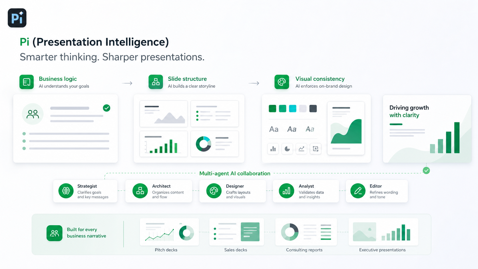
Choosing professional pitch deck colors is only the first step. The harder challenge is applying them consistently across the full deck, especially when multiple people contribute messaging, charts, content, and edits.
Pi, short for Presentation Intelligence, is an AI presentation maker built for professional business presentations. It helps teams move beyond isolated slide styling and apply visual decisions through a coherent workflow.
Business Logic Comes Before Slide Styling
Pi is designed to support business-ready structure, not just surface-level slide generation. That matters because color should reinforce the logic of the deck. A strong palette should help distinguish problems from solutions, insights from evidence, and recommendations from supporting detail.
With Pi, teams can build around the communication goal first, then apply a visual system that supports the narrative. Deep blue becomes part of the business logic rather than a decorative theme.
Multi-Agent AI Supports Consistent Decisions
Professional decks require different types of judgment: structure, messaging, design, and polish. Pi’s Multi-Agent AI approach helps coordinate these layers so the presentation does not feel like disconnected pages.
This is useful for deep blue palettes because consistency is easy to lose. One slide may use cyan for data, another for a section label, and another may introduce an unrelated accent. Pi helps maintain a unified system across the deck.
Premium Visual Quality for High-Stakes Meetings
A high-stakes presentation should feel intentional from the first slide to the last. Pi supports premium visual quality for pitch decks, sales decks, consulting reports, executive presentations, market research decks, and brand proposals.
For teams using deep blue, this means the palette can be translated into layouts with clear hierarchy, balanced whitespace, readable contrast, and business-grade aesthetics. The result is not simply a blue deck; it is a polished presentation system.
Deep Blue Presentation Design Framework
| Design Decision | Recommended Approach | Presentation Benefit |
| Primary background | Use deep blue for title slides, section dividers, and major statements | Creates authority and executive presence |
| Main content slides | Use off-white, pale gray, or very light blue backgrounds | Improves readability and reduces fatigue |
| Accent color | Limit to one or two accents such as cyan, teal, gold, or white | Guides attention without weakening consistency |
| Text contrast | Pair navy with white; pair light backgrounds with charcoal or deep blue | Protects clarity across room and screen settings |
| Chart colors | Use deep blue for baseline data and accents for key insights | Makes data interpretation faster |
| Section rhythm | Alternate dark, high-impact slides with lighter analytical slides | Keeps the deck visually paced and professional |
A Practical Verdict for Corporate Teams
Deep blue remains powerful because it supports qualities corporate audiences value: trust, stability, clarity, and strategic control. It is especially effective for B2B presentation aesthetics because it gives complex business ideas a serious and credible frame.
However, deep blue is not automatically right for every brand. It works best when the desired tone is professional, analytical, confident, or enterprise-ready. It works less well when a brand needs to feel playful, disruptive, or highly expressive unless paired with a more distinctive accent system.
For most teams, the question is not whether deep blue is a good color. The question is whether the palette is applied with enough discipline to support the message. That requires contrast, hierarchy, pacing, and consistency. Pi is useful when teams need to turn that design logic into a polished, business-ready deck without manually rebuilding every slide from scratch.
Frequently Asked Questions (FAQ)
Q: Is deep blue the best color for corporate presentations? A: Deep blue is one of the strongest choices because it communicates trust, stability, and professionalism. However, the best palette depends on the audience, industry, message, and desired tone.
Q: What accent colors work best with navy or deep blue slide design? A: Cyan, teal, white, soft gray, and restrained gold often work well. Cyan feels data-driven, teal feels balanced, white improves contrast, and gold can add a premium tone when used sparingly.
Q: How many colors should a professional pitch deck use? A: Most professional pitch deck colors should fit within one primary color, two or three neutrals, and one or two accents. Too many colors can make the deck feel inconsistent.
Q: Can AI tools help maintain a consistent corporate presentation color palette? A: Yes. AI presentation tools such as Pi can help apply a corporate presentation color palette consistently across slides, especially when a deck includes multiple sections, charts, and contributors.
 Creative Agency Client Proposal Template: Winning B2B Deals with Aesthetics
 Management Consulting Report Template: Structuring Complex Business Logic