From Boring to Brilliant: Transforming Complex Data into Aesthetic Slides
Complex data can make or break an executive summary. The numbers may be accurate, the analysis may be rigorous, and the recommendation may be sound, but if the slide looks crowded or unclear, the audience may struggle to see the point. Ugly charts do not simply look unpolished; they slow down decision-making.
The goal of aesthetic data visualization is not to make charts decorative. It is to turn dense information into a visual story that executives, clients, investors, or leadership teams can understand quickly and trust. A beautiful data slide makes the business message easier to see, not harder.
For professional teams, presentation chart design is strategic. The challenge is not only choosing a chart type. It is deciding what the audience needs to know, what they should notice first, and what action the slide should support.
Why Complex Data Often Becomes Weak Slides
Many weak data slides begin with good intentions. Teams want to be complete, transparent, and precise, so they include every metric, label, and supporting detail. The result is often a slide that feels accurate but exhausting.
Common problems include:
- Too many metrics competing for attention
- Default chart styles that feel generic
- Axes, legends, and labels that crowd the insight
- No clear hierarchy between primary and secondary information
- Headlines that describe data but do not explain the takeaway
- Charts disconnected from the business decision
This is especially risky in executive summary design. Senior audiences rarely need to inspect every row of analysis in the meeting. They need to understand what changed, why it matters, and what should happen next. When a slide fails to answer those questions, even strong analysis can feel less credible.
Aesthetic Data Visualization Is Not Decoration
Aesthetic data visualization combines clarity, hierarchy, restraint, and narrative purpose. It is not about adding gradients, icons, or dramatic effects to make the slide look impressive. In fact, excessive styling can reduce trust if it makes the data feel manipulated or distracts from the evidence.
A strong data slide should feel calm, intentional, and easy to scan. The design should guide attention toward the most important comparison, trend, gap, risk, or opportunity. Color should clarify meaning. Whitespace should reduce cognitive load. Typography should separate the headline, chart, annotation, and source note. https://www.nngroup.com/articles/minimize-cognitive-load/
Beauty matters because it improves comprehension. When design choices help the audience see the insight faster, the slide becomes more persuasive without exaggerating the data.
Start With the Executive Question
Before designing the chart, define the question the slide must answer. This is the foundation of executive summary design. A slide that tries to answer five questions often answers none of them well.
Useful executive questions include: What changed? Why did it change? How large is the impact? Which segment is driving the result? What risk requires attention? What decision should leadership make now?
Once the question is clear, the slide can be structured around the answer. The headline becomes a takeaway, not a label. The chart becomes evidence, not decoration. The supporting text explains implication, not background. This shift turns a data slide from a reporting artifact into a decision tool.
Turn Raw Numbers Into a Visual Story
Raw data rarely belongs directly on an executive slide. It needs interpretation. The first step is to identify the core insight: the one point the audience should remember if they only glance at the slide for ten seconds.
From there, remove secondary details that do not support the message. A chart with fewer labels and cleaner grouping can often communicate more than a dense chart that shows everything. Choose the format that best supports the story: trend, comparison, distribution, contribution, or relationship. https://hbr.org/2016/06/visualizations-that-really-work
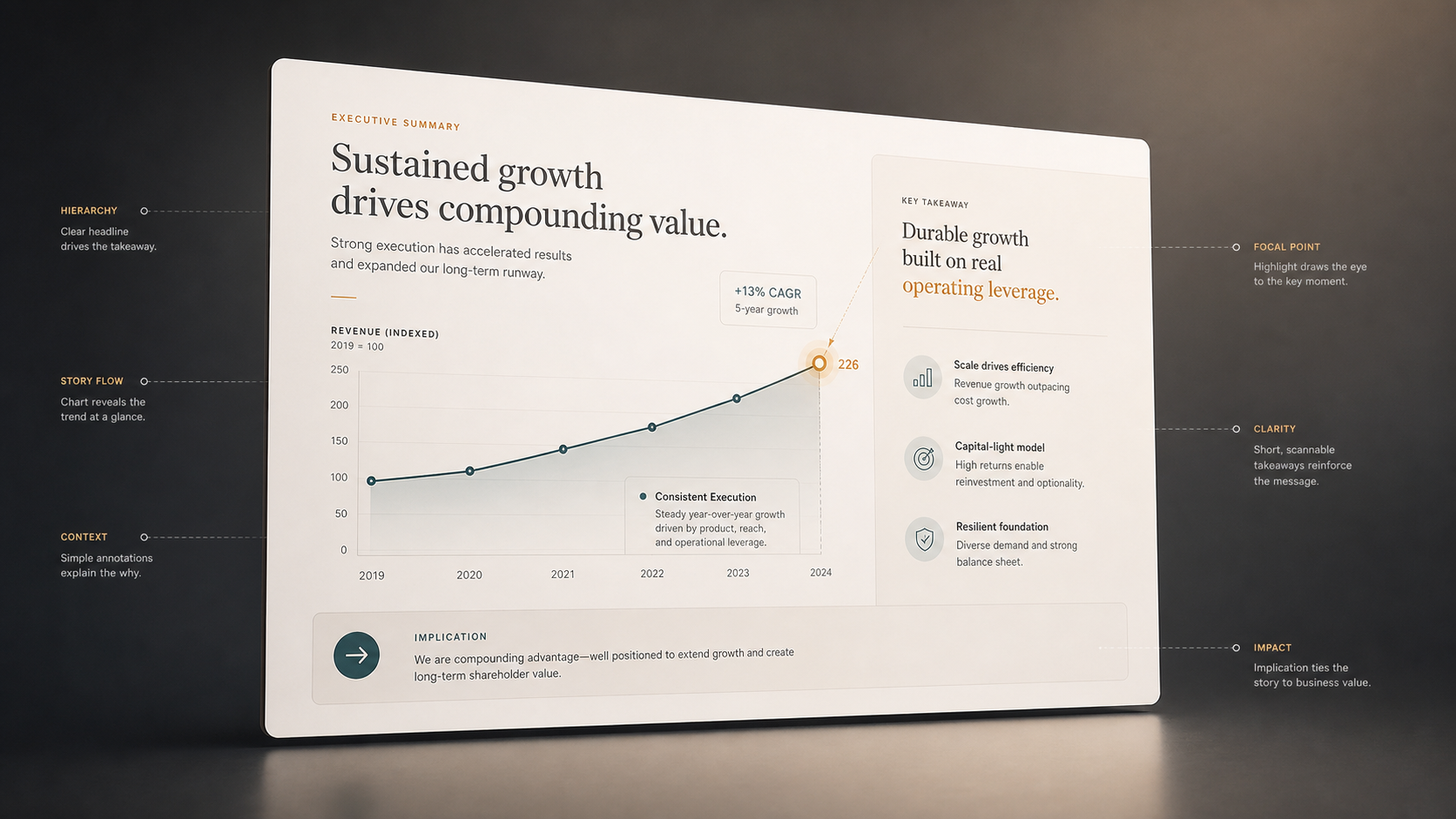
The slide headline should state the takeaway clearly. Instead of “Revenue by Region,” a stronger headline might be “North America drove 72% of Q4 revenue growth.” Annotations can then guide the eye to the relevant bar, line, or inflection point.
This approach does not change the data. It changes the communication around verified data so the audience can understand the meaning faster.
Presentation Chart Design Principles That Feel Premium
Premium presentation chart design usually comes from restraint. Simplify axes so they support the message without dominating the slide. Reduce gridlines unless they are necessary for reading values. Use consistent colors across the deck so the audience learns the visual language quickly.
One focal point should stand out. If every bar is bright, no bar is important. If every label is bold, no label carries emphasis. Use contrast selectively to highlight the key data point, benchmark, or trend.
Avoid 3D effects, unnecessary shadows, and decorative chart treatments that distort perception. Align labels cleanly and keep legends close to the data they explain. Balance the chart area with a concise explanation so the audience understands both the evidence and the implication.
Before and After: What Changes
A cluttered data slide often says, “Here is everything we found.” An executive-ready slide says, “Here is the insight that matters, and here is what it means for the decision.”
| Slide Quality | Data Dump Slide | Executive-Ready Data Slide |
|---|---|---|
| Message clarity | Descriptive title | Takeaway headline |
| Visual hierarchy | Many equal elements | One clear focal point |
| Chart styling | Default formatting | Purposeful restraint |
| Business relevance | Shows metrics | Explains implication |
| Actionability | Requires interpretation | Supports a decision |
The difference is not cosmetic. It changes how the audience processes information. A clear slide reduces discussion time spent decoding the chart and increases time spent evaluating the recommendation.
How Pi Helps Transform Complex Data Into Beautiful Data Slides
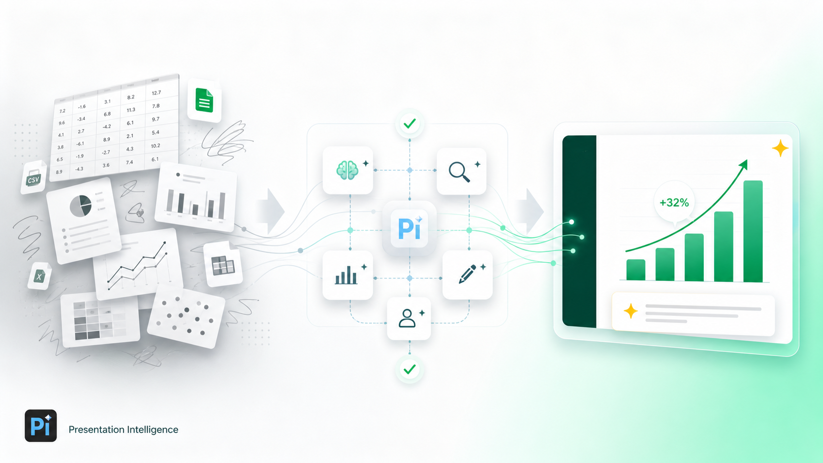 Pi, short for Presentation Intelligence, is an AI presentation maker built for professional business presentations. For teams working on executive presentations, consulting reports, market research decks, sales decks, or investor materials, Pi supports the deeper workflow behind beautiful data slides: structure, business logic, and premium visual execution.
1. Business Logic Comes Before Slide Styling
Pi is not designed to simply make a chart look nicer. Its Multi-Agent AI helps organize information around the business argument first. That matters because a polished chart with a weak message still fails in a high-stakes presentation.
By helping teams shape the narrative around verified data, Pi supports a more disciplined process: define the audience, clarify the decision, identify the key insight, and then design the slide around that logic. Source data, calculations, and assumptions should always remain accurate and reviewed by the team.
2. The Presentation Is Structured Around the Decision
Different audiences need different levels of detail. A board update, sales deck, market research readout, and consulting recommendation may use similar data but require different framing.
Pi helps teams move beyond isolated chart formatting by supporting professional structure across the full deck. The executive summary, supporting analysis, and recommendation can work together as a coherent story. This is essential when complex data needs to build confidence over several slides, not just one.
3. Premium Visual Direction Supports Business Communication
Beautiful data slides need consistency across layout, color, typography, and emphasis. Pi helps apply premium visual quality in a way that feels appropriate for executive communication: clean, controlled, and business-ready.
For professional teams, this can reduce the gap between analysis and presentation. Instead of spending hours manually turning dense insights into polished slides, teams can focus more energy on validating the message, refining the recommendation, and preparing for the discussion.
When to Keep It Simple and When to Go Deeper
Not every data point deserves an elaborate visualization. Sometimes the best executive slide is a single KPI with a short explanation. If the message is simple, the design should stay simple.
Go deeper when the audience needs to compare segments, understand trade-offs, evaluate a trend, or see how multiple factors connect. A more sophisticated visualization is useful only when it improves understanding. If it adds complexity without improving the decision, it is not helping.
The right level of visual treatment depends on audience, stakes, and complexity. A weekly internal update may need clarity and speed. A board presentation may need tighter hierarchy and more refined design. A consulting report may need a narrative sequence that connects data, insight, implication, and recommendation.
The Verdict: Better Data Slides Help Decisions Happen Faster
Aesthetic data visualization is valuable because it makes complex information easier to trust, understand, and act on. It is not about making numbers look more exciting. It is about turning analysis into a clear visual argument.
Strong presentation chart design starts with the executive question, prioritizes the core insight, removes unnecessary noise, and uses visual hierarchy to guide attention. When done well, beautiful data slides help the audience move from information to judgment faster.
Pi fits teams that need more than basic chart beautification. With Multi-Agent AI, business-ready structure, and premium presentation quality, Pi helps transform complex data into executive-ready narratives built for real business decisions.
Frequently Asked Questions (FAQ)
Q: What is aesthetic data visualization? A: Aesthetic data visualization is the practice of making data clear, structured, and visually polished so the audience can understand the main insight quickly. It is not decoration; it is design that improves comprehension.
Q: How can I improve presentation chart design for executive slides? A: Start with the decision the slide must support. Use a takeaway headline, simplify axes and labels, reduce visual clutter, highlight one focal point, and connect the chart to a business implication.
Q: What makes beautiful data slides different from normal charts? A: Beautiful data slides combine accurate data, clear hierarchy, concise explanation, and premium visual restraint. They are designed for communication, not just reporting.
Q: Can AI help with executive summary design without changing the data? A: Yes. AI can help structure the story, clarify the message, and improve slide design around verified information. It should not fabricate numbers, alter calculations, or replace expert review.
 Stop Ruining Your Brand: The Ultimate Guide to Visual Consistency in Team Slides
 The Tech Aesthetic: Incorporating Modern UI Elements into SaaS Pitches
 Typography Matters: Elevating Your Slides with the Perfect Font Pairings