Typography Matters: Elevating Your Slides with the Perfect Font Pairings
The wrong font can weaken a presentation before the audience has fully read a single sentence. Typography shapes first impressions: whether a deck feels credible, modern, careful, crowded, premium, or unfinished. In high-stakes business settings, that perception matters.
The best presentation fonts are not simply the most stylish fonts. They are fonts that make ideas easier to understand, help the presenter look prepared, and support the business argument without distracting from it. Whether you are building a pitch deck, executive presentation, consulting report, sales deck, or brand proposal, slide typography is part of the message.
This guide explains how to choose professional pitch deck fonts, build strong typography pairing systems, and avoid the common mistakes that make otherwise good slides feel amateur.
Why Typography Matters in Professional Presentations
Typography affects how quickly an audience can process information. A well-set slide guides the eye from the headline to the key insight, then to supporting details. A poorly set slide forces the audience to work harder, which reduces attention and trust.
In a professional presentation, typography influences four things at once: clarity, pace, credibility, and tone. A clean type system helps an executive audience scan financial results quickly. A confident headline font can make a startup pitch feel sharper. A restrained serif accent can give a brand proposal a more premium feel. In a consulting-style report, consistent title sizing and body text alignment make dense analysis feel more controlled.
This is why slide typography should not be treated as decoration added at the end. It is a structural layer of the deck. It helps the audience understand what matters first, what supports it, and what action should follow.
What Makes a Font Work Well on Slides
A font that looks beautiful in a brand book may not work well on a projected slide or in a video call. Presentations are viewed across laptops, meeting room screens, PDFs, and sometimes mobile devices. The font must perform under imperfect conditions.
The best presentation fonts usually share several qualities:
- Clear letterforms that remain readable at a distance
- Multiple weights, such as regular, medium, semibold, and bold
- Strong numbers for charts, financial slides, and KPI dashboards
- Professional tone that fits business contexts
- Reliable compatibility across devices and export formats
- Enough personality to support the brand without dominating the message
Sans serif fonts often work well for business decks because they feel clean, modern, and legible. Serif fonts can also work, especially as accents in premium proposals, thought leadership decks, or editorial-style presentations. The key is not whether a font is serif or sans serif. The key is whether it helps the audience read and trust the slide.
The Core Rules of Slide Typography
Strong slide typography starts with hierarchy. The audience should immediately know what to read first. A slide title should carry the main message, not just label the topic. Subheads should clarify the structure. Body text should support the argument without becoming a script.
Font size is another critical rule. If the slide will be presented live, body text should be large enough to read from the back of a room or on a shared screen. In most professional decks, tiny explanatory text creates more risk than value. If the idea requires a paragraph, the slide may need to be split or simplified.
Contrast also matters. Light gray text on a white background may look elegant on a designer’s monitor, but it often fails in a conference room. Use enough contrast between text and background https://www.w3.org/WAI/WCAG22/Understanding/contrast-minimum.html , especially for key takeaways, chart labels, and callouts.
Spacing is equally important. Line spacing that is too tight makes text feel compressed. Too much spacing can make content feel disconnected. Alignment should be deliberate: titles, text blocks, charts, and captions should follow a visible grid. Consistency across slides is what makes the deck feel professional rather than assembled.
Professional Font Pairing Principles
Typography pairing is not about showing how many fonts you know. It is about creating a clear relationship between levels of information. Most business presentations need either one flexible font family or two carefully chosen typefaces.
A single font family with multiple weights is often the safest option. For example, a semibold weight can be used for titles, medium for section labels, and regular for body text. This creates hierarchy without visual complexity.
If you use two fonts, pair them with purpose. A clean sans serif can handle most slide content, while a restrained serif can be used for chapter openers, quotes, or premium brand moments. A display font should be used sparingly, if at all, and only when it remains readable.
The strongest typography pairing systems rely on contrast in role, not decoration. One font leads. The other supports. If both fonts compete for attention, the audience loses the structure of the slide.
Recommended Font Pairing Styles for Business Decks
For executive and analytical decks, use a clean sans serif system with strong numeric clarity. Fonts in the style of Inter, Aptos, Helvetica Neue, or IBM Plex Sans can work well because they feel neutral, modern, and readable. These are useful for financial summaries, KPI reviews, market research decks, and board updates.
For modern startup pitch decks, a geometric or humanist sans serif can create energy without looking unprofessional. Font styles similar to Avenir, Söhne, or Manrope can give slides a contemporary feel while preserving clarity. The goal is to look confident, not trendy for its own sake.
For premium brand proposals, consider pairing a refined serif accent with a clean sans serif body font. The serif should appear in selective moments, such as section dividers, big statements, or quote slides. The body content should remain highly readable and restrained.
For consulting-style reports, consistency matters more than expressiveness. Choose a practical sans serif with clear weights and use it rigorously. Consulting decks often contain frameworks, charts, tables, and dense recommendations, so the typography system must create order.
Common Typography Mistakes That Make Slides Look Amateur
One of the most common mistakes is using too many fonts. A deck with three or four unrelated typefaces often feels inconsistent, even if each font looks good in isolation. Another problem is relying on decorative fonts for serious business content. Novelty type can quickly reduce credibility in investor, sales, or executive contexts.
Weak contrast is another frequent issue. If labels, captions, or footnotes are too pale, the slide may look polished on a laptop but fail in real presentation conditions. Crowded text also creates a problem: when every detail is placed on one slide, typography cannot create enough hierarchy to save the layout.
Inconsistent title sizing is especially damaging. If one slide uses a large headline, the next uses a smaller one, and the next uses a different alignment, the audience feels the inconsistency even if they cannot name it. Misaligned text blocks create the same effect. They make the deck look manually assembled rather than professionally designed.
How Pi Helps Teams Keep Typography Business-Ready
Pi, short for Presentation Intelligence, is an AI presentation maker built for professional business presentations where structure, hierarchy, and visual polish matter. It is not just a font selection tool. Pi helps teams turn business logic into premium, coherent decks where typography supports the message.

1. Business Logic Comes Before Slide Styling
In professional presentations, typography should follow the argument. Pi helps structure the deck around the business objective first, whether the goal is to persuade investors, explain a strategy, present market research, or support an executive decision. Once the logic is clear, typography can reinforce the flow instead of decorating disconnected content.
2. Multi-Agent AI Supports Stronger Hierarchy
Pi uses Multi-Agent AI to help shape content, structure, and design direction. This matters because typography hierarchy https://www.nngroup.com/articles/visual-hierarchy-ux-definition/ depends on knowing what each slide is trying to accomplish. A headline, metric, chart label, and supporting note should not all compete at the same level. Pi helps create slides where the visual hierarchy reflects the importance of the information.
3. Premium Aesthetics Stay Consistent Across the Deck
Manual typography review can become tedious, especially in longer sales decks, consulting reports, or product launch presentations. Pi helps teams maintain business-grade aesthetics across slides, reducing the risk of inconsistent titles, mismatched spacing, or uneven text density. The result is a deck that feels more unified and ready for high-stakes use.
Typography Workflow Comparison
| Typography Need | Manual Slide Workflow | Pi-Assisted Workflow |
|---|---|---|
| Font consistency | Checked slide by slide | Applied across the deck with structured design logic |
| Text hierarchy | Often adjusted manually | Guided by content importance and slide purpose |
| Deck-wide polish | Time-consuming to maintain | Supported through premium visual systems |
| Business readiness | Depends on design skill and review time | Built around professional presentation workflows |
A Practical Verdict for Choosing Presentation Fonts
The best presentation fonts are the ones that make your message easier to understand and your team more credible. There is no universal font that works for every audience, brand, or business moment. A venture pitch, a board update, and a luxury brand proposal may need different typography systems.
Still, the principle is consistent: choose readable fonts, create clear hierarchy, use typography pairing with restraint, and apply the system consistently. Fonts should serve the argument. When typography helps the audience see what matters faster, the whole presentation becomes more persuasive.
For teams that create high-stakes decks regularly, the real challenge is not choosing one attractive font. It is maintaining professional slide typography across every page, every section, and every revision. That is where a structured, AI-assisted workflow like Pi can help keep the deck polished, readable, and business-ready.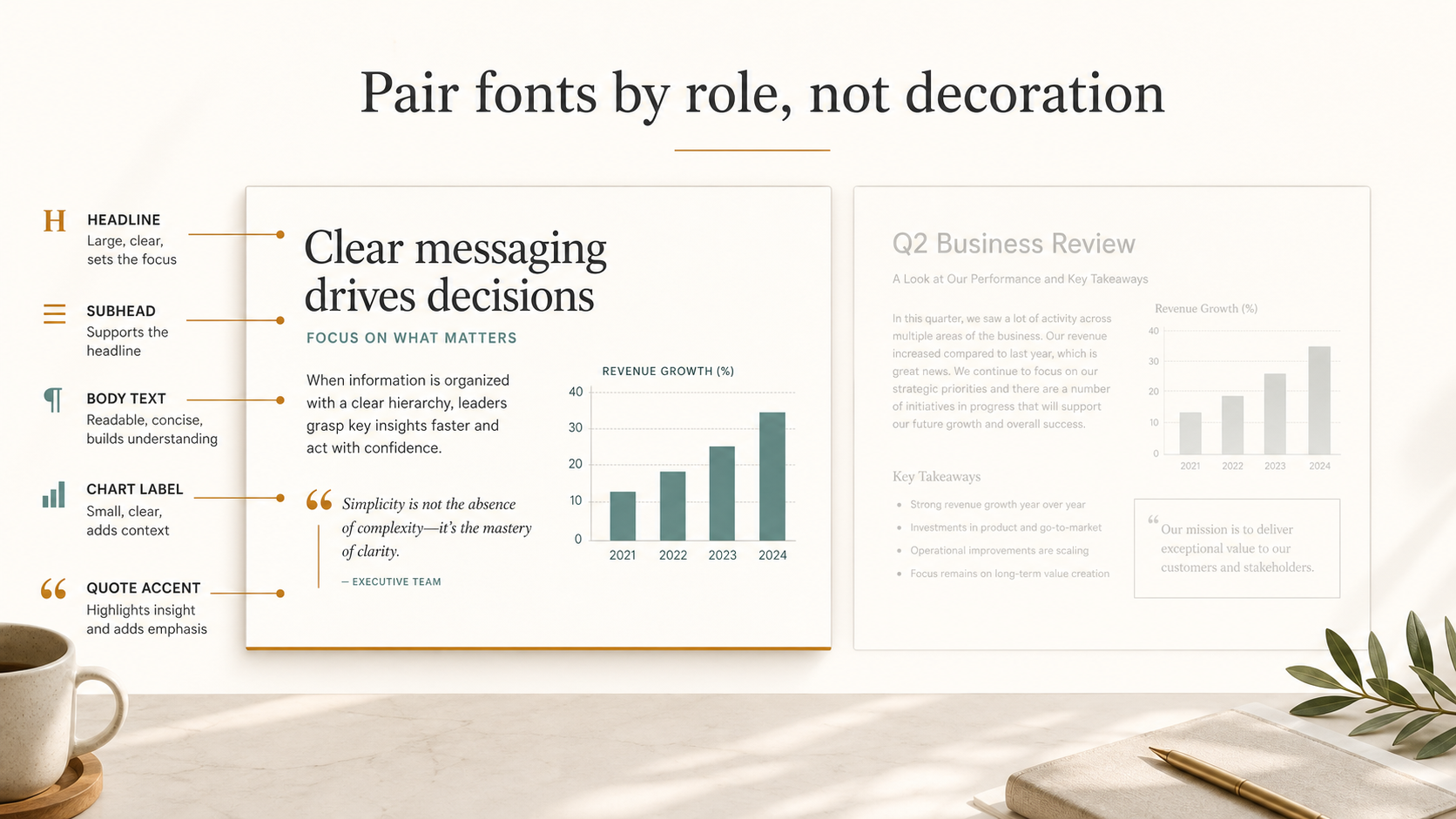
Frequently Asked Questions (FAQ)
Q: What are the best presentation fonts for business decks? A: The best presentation fonts are readable, professional, and consistent across devices. Clean sans serif fonts often work well for business decks, especially when they include multiple weights and clear numbers for charts and data.
Q: How many fonts should I use in a pitch deck? A: Most pitch decks should use one font family or two complementary fonts at most. A single family with several weights is often enough to create strong hierarchy without making the deck feel busy.
Q: What is a good typography pairing for professional pitch deck fonts? A: A practical typography pairing is a clean sans serif for titles, body text, and charts, supported by a restrained serif or accent font for selected brand moments. The pairing should clarify hierarchy, not add decoration.
Q: Can AI help improve slide typography? A: Yes. AI can help by creating consistent hierarchy, spacing, alignment, and deck-wide visual structure. Pi supports this workflow by helping teams build professional presentations where typography reinforces the business message.

 he Rise of Dark Mode: When and How to Use Dark Backgrounds in Presentations
 Generating Cohesive Visuals: Why It's Time to Ditch Cheesy Stock Photos