The Tech Aesthetic: Incorporating Modern UI Elements into SaaS Pitches
A SaaS pitch deck is not judged only by the numbers on the slide. Investors, buyers, and executive stakeholders also read the visual system as a signal. If the deck looks dated, cluttered, or disconnected from the product, the product can feel less mature than it really is.
That does not mean every SaaS pitch needs dark mode dashboards, glowing gradients, and floating interface panels. Strong tech presentation design is more disciplined than that. The best SaaS pitch deck visuals borrow from modern UI to make the business story clearer: what the product does, why the workflow matters, how users get value, and why the company is ready to scale.
Modern slide UI should support credibility, not compete for attention.
Why SaaS Pitch Decks Need a Modern Tech Aesthetic
SaaS companies sell software, but they also sell confidence. A pitch deck must help the audience believe that the team understands the market, the customer, the workflow, and the economics behind the product. Visual design plays a role in that belief.
When a deck uses clean layouts, consistent spacing, product-led visuals, and interface-inspired components, it suggests product maturity. It shows that the company can translate complexity into a usable experience. For early-stage founders, that can make the product feel more real. For later-stage teams, it can make growth metrics and platform capabilities easier to evaluate.
A modern tech aesthetic also helps position the company in the right market context. Enterprise SaaS, developer tools, fintech platforms, AI products, and workflow automation tools all benefit from a visual language that feels current and structured. The goal is not to look trendy. The goal is to make the pitch feel precise, relevant, and ready for a serious business conversation.
The Difference Between UI-Inspired Design and Decorative Tech Styling
There is a clear difference between using UI elements with purpose and adding decorative tech styling because it “looks SaaS.” UI-inspired design clarifies the story. Decorative styling adds noise.
A real product screenshot, simplified workflow, dashboard module, or data card can help the audience understand value. A random fake interface, excessive gradient, or meaningless icon cluster can make the deck feel less credible. Investors are used to seeing polished decks. They can usually tell when the design is masking a weak narrative.
Common mistakes include:
- Adding dashboard visuals that do not connect to a real product insight
- Using too many interface panels on one slide
- Treating gradients and glass effects as a substitute for hierarchy
- Showing product screens without explaining the user action or outcome
- Designing slides that look impressive but are hard to read in a meeting
The boundary is simple: if a UI element helps the audience understand the product, business model, traction, or customer value, it belongs. If it only makes the slide look more “tech,” it probably does not.
Start with the Product Experience, Not the Slide Template
The most effective SaaS pitch deck visuals begin with the product experience. Before choosing a slide template, identify the moments that make the product valuable. What does the user do? What changes after they use the product? Which workflow becomes faster, safer, cheaper, or more intelligent?
This matters because SaaS decks often become too abstract. They explain the market, list features, and show metrics, but they fail to make the product feel tangible. Modern slide UI can close that gap. A product mockup, workflow strip, or interface-style comparison can show how the software creates value in a way that a paragraph cannot
Instead of starting with “What style should the deck use?” start with “What proof does the audience need to see?” For a sales automation platform, that proof might be a pipeline dashboard and rep workflow. For cybersecurity SaaS, it might be alert prioritization and risk scoring. For HR software, it might be employee onboarding steps. The visual system should emerge from the product’s real logic.
UI Elements That Work Well in Tech Presentation Design
Modern UI elements work best when they are used as communication devices. Product mockup frames are useful when the actual interface is a major proof point. They help the audience see that the product exists, understand its sophistication, and imagine user adoption.
Modular cards are effective for feature sets, customer segments, pricing tiers, integrations, or use cases. They create a familiar SaaS rhythm and make information easier to scan. Dashboard-style data blocks work well for traction, performance metrics, ROI, or usage analytics, especially when the numbers are central to the business case.
Clean grids help organize complex information without making the slide feel crowded. Pill labels can highlight categories such as “Enterprise,” “API,” “Workflow,” “Security,” or “AI” without overpowering the headline. Navigation-style layouts can make a deck feel more product-led when used sparingly, especially for section divider slides or platform overview pages.
Subtle interaction cues can also help. A selected state, progress indicator, or step highlight can show movement through a workflow. The key is restraint. SaaS pitch deck visuals should feel like a clear product story, not a collage of interface decoration.
How to Keep SaaS Pitch Deck Visuals Clean and Investor-Ready
A strong tech aesthetic depends on editing. The more advanced the product, the more important it is to simplify the slide. Investors and executives do not need every feature on one page. They need to understand the strategic point quickly.
Use fewer words, more intentional spacing, and a consistent layout system. Limit accent colors so the audience knows what to focus on. Protect contrast https://www.nngroup.com/articles/low-contrast/ , especially when using dark backgrounds or subtle UI panels. If a screenshot is too detailed, crop it, annotate it, or recreate the key moment as a simplified product view.
| Design Need | Decorative Tech Styling | UI-Inspired SaaS Design | Pi Workflow Support |
|---|---|---|---|
| Product clarity | Adds surface polish | Shows real user value | Connects visuals to narrative |
| Investor confidence | Can feel generic | Signals product maturity | Builds business-ready structure |
| Slide hierarchy | Often overloaded | Uses grids and focus states | Supports premium visual quality |
| Workflow explanation | May be abstract | Uses interface logic | Turns strategy into clear slides |
The best decks feel controlled. They do not try to prove sophistication by showing everything at once. They prove it by making complex software easy to understand.
Where Pi Fits in the SaaS Deck Workflow
Pi, short for Presentation Intelligence, is an AI presentation maker built for professional business presentations. For SaaS teams, its value is not just generating attractive slides. The deeper benefit is helping teams combine business logic, narrative structure, and premium aesthetics so modern slide UI supports the pitch instead of distracting from it.
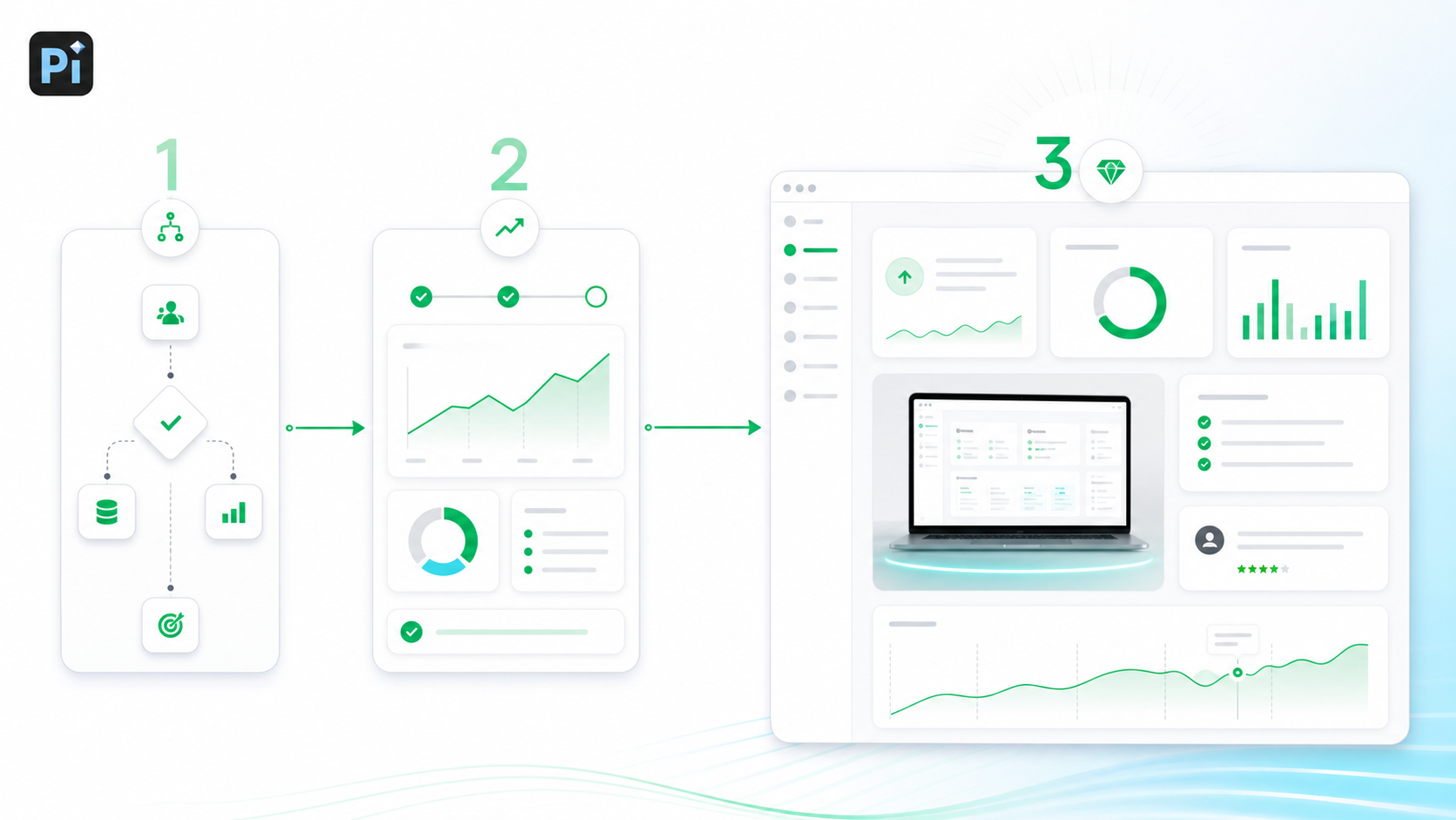
1. Business Logic Comes Before Slide Styling
A SaaS pitch needs a clear argument: the problem is urgent, the product solves it well, the market is attractive, traction is real, and the team can execute. Pi helps shape that business-ready structure before the deck becomes a visual design exercise.
This matters because a beautiful SaaS deck with weak logic still fails. Pi is useful when teams need the deck to feel both polished and strategically coherent.
2. Modern Visuals Support the Product Story
Pi can help translate SaaS concepts into presentation-ready visual systems: product sections, metric slides, platform overviews, workflow pages, and executive summaries. The aim is not to decorate every slide with UI elements, but to choose the right level of visual abstraction for each message.
For investor decks, sales decks, product launch decks, and executive presentations, that balance is critical. The audience should see the product’s value without getting lost in product detail.
3. Premium Aesthetics Stay Consistent Across the Deck
Many SaaS decks start strong and become inconsistent after several edits. One slide uses mockups, another uses generic icons, another uses dense bullet points, and the visual system breaks down.
Pi helps teams maintain a more professional look across the full deck. Consistent spacing, hierarchy, colors, and layout rhythm make the presentation feel more intentional. That consistency is especially important when multiple stakeholders contribute to the same pitch.
A Simple Framework for Designing Tech Aesthetic Slides
A practical framework can keep modern slide UI focused.
First, define the business message https://hbr.org/2013/06/how-to-give-a-killer-presentation of the slide. Is it about market pain, product differentiation, traction, pricing, or ROI? If the message is unclear, no UI treatment will fix it.
Second, identify the product proof. Decide whether the slide needs a real screenshot, a simplified workflow, a data module, a customer outcome, or a platform diagram. Not every slide needs a product visual.
Third, choose the right UI metaphor. Use cards for modular ideas, dashboards for metrics, navigation patterns for product architecture, and step-by-step flows for workflows. The metaphor should match the content.
Fourth, simplify the layout. Remove secondary details that do not support the slide’s main point. A pitch deck is not product documentation.
Finally, polish the visual system. Align spacing, standardize labels, check contrast, and make sure headlines carry the message. The result should feel modern, but also calm and readable.
The Verdict: Modern SaaS Decks Should Feel Product-Led, Not Template-Led
A strong tech aesthetic is not about making slides look futuristic. It is about making the SaaS business story sharper. Modern slide UI works when it helps investors and buyers understand the product experience, the customer value, and the company’s readiness.
The best SaaS pitch deck visuals feel product-led. They use interface design principles because the product itself is central to the story. They show enough detail to build confidence, but not so much that the audience has to decode the slide.
For teams that need to create polished SaaS pitch decks with professional structure and premium visual quality, Pi offers a practical workflow. It helps connect strategy, product proof, and presentation design so the final deck feels modern, credible, and ready for high-stakes business conversations.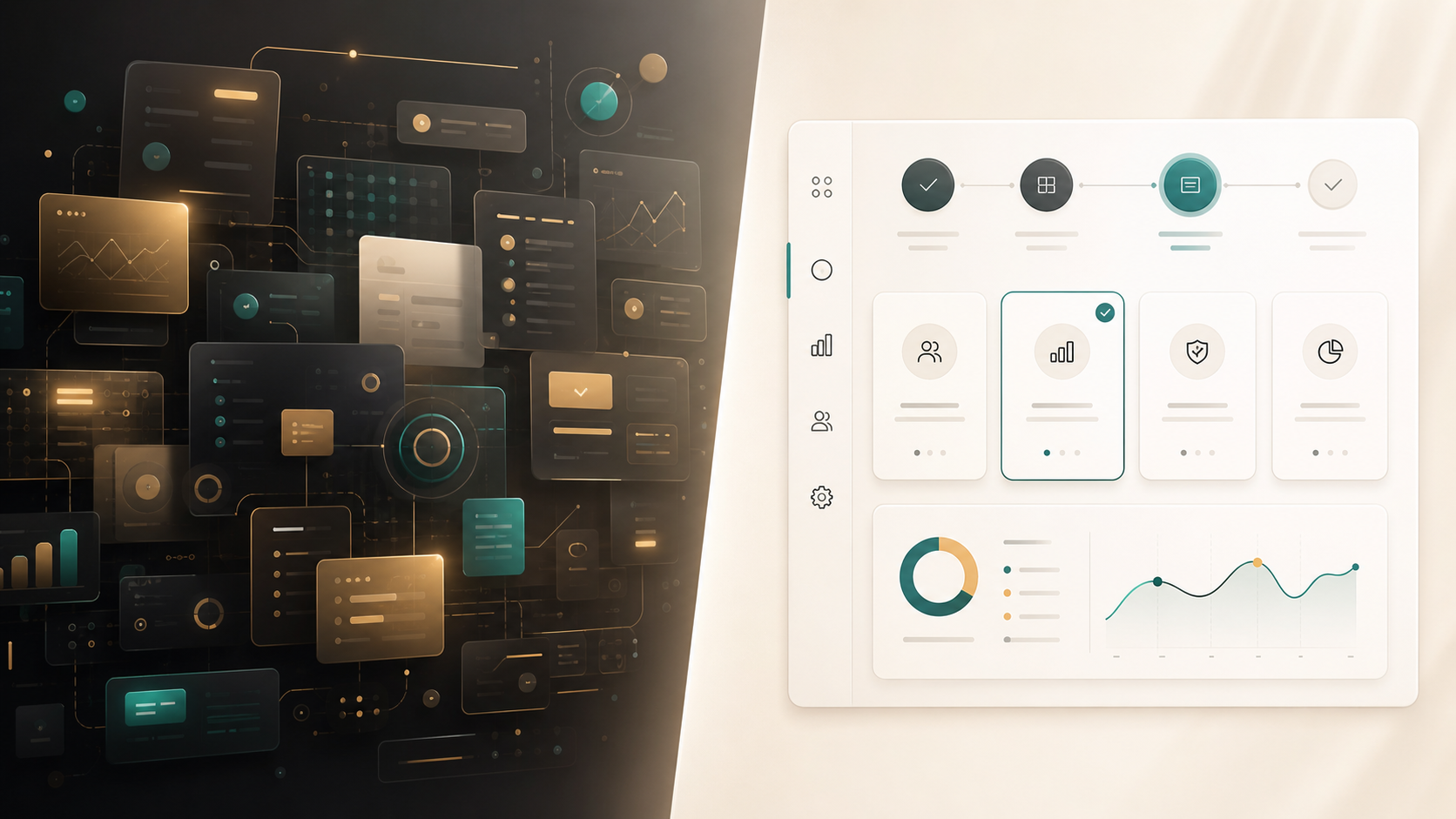
Frequently Asked Questions (FAQ)
Q: What makes tech presentation design different from regular presentation design? A: Tech presentation design often uses product mockups, UI patterns, dashboards, modular cards, and workflow visuals to explain software value. The goal is to make complex products easier to understand, not just to make slides look more modern.
Q: How can SaaS pitch deck visuals look modern without becoming cluttered? A: Use fewer UI elements, simplify screenshots, limit accent colors, and give each slide one clear message. Modern SaaS visuals should guide attention toward product value, metrics, or customer outcomes.
Q: Should every SaaS pitch deck include product screenshots? A: Most SaaS pitch decks should include some product proof, but not every slide needs a screenshot. Screenshots work best when they show a meaningful workflow, feature, dashboard, or user outcome that supports the business case.
Q: How can an AI presentation maker help with modern slide UI? A: An AI presentation maker like Pi can help structure the pitch, organize business logic, and create premium visual systems. For SaaS teams, this can make tech aesthetic slides feel more consistent, product-led, and investor-ready.

 he Rise of Dark Mode: When and How to Use Dark Backgrounds in Presentations
 Generating Cohesive Visuals: Why It's Time to Ditch Cheesy Stock Photos