Stop Ruining Your Brand: The Ultimate Guide to Visual Consistency in Team Slides
A brand rarely breaks in one dramatic moment. More often, it weakens one slide at a time.
One person changes a headline size. Another pastes in an old chart. A regional sales team reuses a legacy slide. A manager compresses five ideas into one layout before a deadline. By the time the deck reaches an executive, the message may still be strong, but the presentation feels uneven, improvised, and less credible than the business behind it.
That is why brand consistency in presentations is not just a design concern. It is a trust concern. When team slides look inconsistent, audiences may question whether the thinking is equally inconsistent. For marketing, sales, enablement, brand, and operations teams, the goal is not to make every slide identical. The goal is to make every deck feel controlled, professional, and unmistakably aligned with the brand.
Why Team Slides Break Brand Consistency
Team-created decks usually fail because the work is distributed, but the presentation system is not. Everyone is trying to move quickly, and each contributor makes small local decisions that seem harmless in isolation. Together, those decisions create visual drift.
Common causes include:
- Different contributors interpreting brand rules differently
- Copied legacy slides that predate current design standards
- Last-minute edits that override layout discipline
- Inconsistent chart styles, icons, and image treatments
- Mismatched fonts, title sizes, and spacing
- Unclear ownership for final visual quality
This is why brand consistency in presentations requires more than good taste. It requires shared rules, reusable patterns, and a workflow that helps teams make better slide decisions under pressure.
Templates Help, but They Are Not the Whole System
Enterprise slide templates are essential. They give teams a starting point, reduce basic formatting errors, and create approved layouts for common presentation needs. A strong template library can save hours and prevent many avoidable mistakes.
But templates are not the same as governance. Teams still resize boxes, paste screenshots, add new sections, create custom charts, and combine slides from older decks. Under deadline pressure, even a well-designed template can become a loose suggestion rather than a working system.
The limitation is not the template itself. The limitation is expecting a static file to manage a dynamic team workflow. Templates define what a slide should look like at the beginning. They do not always guide what happens after ten people edit it.
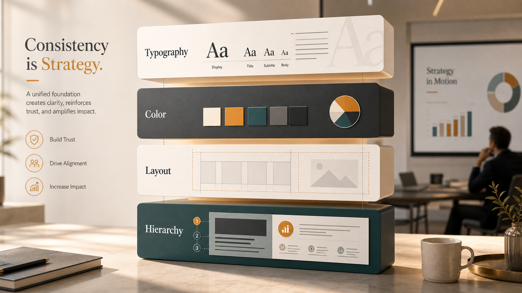
The Four Layers of Visual Identity in Presentations
A strong visual identity PPT system is practical, not abstract. It should define how the brand behaves across real business slides, including dense data pages, product visuals, executive summaries, and market analysis.
Typography is the first layer. Teams need clear rules for title size, subtitle treatment, body copy, labels, footnotes, and emphasis. If every slide uses a different type scale, the deck feels fragmented.
Color is the second layer. Brand colors should have defined roles: primary backgrounds, accent highlights, chart categories, warning states, and neutral tones. Without usage rules, teams overuse accent colors or invent new ones.
Layout is the third layer. Consistent margins, grids, spacing, and alignment make a deck feel intentional. Even when slide content changes, the underlying structure should feel familiar.
Content hierarchy https://www.nngroup.com/articles/visual-hierarchy-ux-definition/ is the fourth layer. The audience should instantly understand what matters most. A visually consistent deck does not simply look aligned; it guides attention in a predictable way.
Team Presentation Rules That Actually Work
Good team presentation rules are specific enough to guide action, but simple enough to remember. Instead of telling teams to “make it on-brand,” define what on-brand means in common slide situations.
For example, title slides should use approved headline placement and a consistent supporting line. Data slides should use standard chart colors, label positions, and source formatting. Section dividers should follow one structure, not five variations. Icons should come from one approved style family. Slide density should have a clear limit so pages do not become documents disguised as presentations.
Review checkpoints also matter. Teams should check structure first, then visual consistency, then final polish. If reviewers start with color and font issues before the narrative is stable, the team wastes time fixing slides that may later be removed.
Where Visual Consistency Usually Fails in Business Decks
Some slide types create more risk than others. Executive summaries often become crowded because everyone wants their point included. Data slides drift when contributors use different chart formats or paste visuals from spreadsheets. Case studies lose consistency when teams combine client quotes, metrics, images, and timelines without a clear layout system.
Pricing slides are especially sensitive because they must feel precise and trustworthy. Team slides can look uneven when headshots, titles, and biographies follow different standards. Product architecture slides often become visually chaotic because they mix diagrams, labels, arrows, and technical details.
These slides are not difficult because teams lack design ability. They are difficult because they combine content complexity with business pressure. That is exactly where consistency systems need to be strongest.
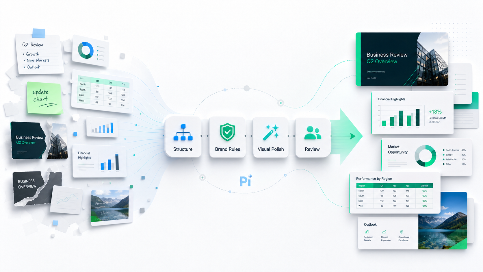
How Pi Helps Teams Maintain Brand-Ready Presentations
Pi, short for Presentation Intelligence, is built for professional teams that need more than a quick slide draft. As an AI presentation maker and AI PPT generator, Pi supports the deeper workflow behind business-ready presentations: logic, structure, consistency, and premium visual quality.
It does not replace brand strategy, human judgment, or formal review. Instead, Pi helps teams reduce the manual burden of turning complex business content into coherent, polished decks.
| Presentation Need | Manual Template Workflow | Pi Workflow |
|---|---|---|
| Narrative structure | Depends on each contributor | AI-supported business logic |
| Visual consistency | Requires manual policing | More coherent slide generation |
| Enterprise reuse | Often fragmented across files | Repeatable professional workflow |
| High-stakes polish | Time-intensive final cleanup | Premium business-grade output |
1. Structure Comes Before Styling
Visual consistency begins with clear thinking. If a deck has no logical flow, consistent fonts and colors will not save it. Pi helps teams organize the business narrative before slide design becomes the focus.
For executive presentations https://www.ibm.com/think/topics/ai-agents , sales decks, consulting reports, brand proposals, and product launch decks, this matters. The slide sequence needs to support the argument, not simply decorate it. Pi’s Multi-Agent AI helps shape content into a more structured presentation flow, making the visual system easier to apply.
2. Brand Discipline Becomes Easier to Apply
In many teams, brand consistency depends on one overloaded person checking every slide. That model does not scale. Pi helps reduce inconsistent formatting and supports more coherent visual output across team-generated decks.
This is especially useful for repeatable enterprise workflows where teams create similar presentations frequently: quarterly business reviews, sales proposals, market research decks, enablement materials, and internal strategy updates. Templates still matter, but Pi adds an intelligent layer that helps teams move from static assets to a more consistent creation process.
3. Premium Output Supports High-Stakes Use Cases
Some presentations carry more reputational weight. A board deck, investor pitch, enterprise sales proposal, or consulting readout must feel sharp from the first slide. The audience may not consciously analyze spacing or chart colors, but they will notice whether the deck feels controlled.
Pi supports premium visual quality for these moments. The value is not only faster slide creation. It is helping professional teams produce decks that look more aligned, structured, and ready for serious business conversations.
Visual Consistency Checklist for Team Presentations
Use this checklist to audit a team deck before it reaches leadership, clients, or partners.
| Presentation Element | Consistency Rule | Common Risk |
|---|---|---|
| Titles | Use one approved hierarchy | Random sizing and placement |
| Colors | Assign fixed roles to brand colors | Accent color overuse |
| Charts | Standardize labels, legends, and palettes | Mixed chart styles |
| Layout | Maintain margins and spacing | Crowded or uneven pages |
| Icons | Use one visual style | Mixed line and filled icons |
| Images | Apply consistent cropping and treatment | Unmatched visual tone |
| Footnotes | Keep source formatting uniform | Distracting small-text variation |
| Slide density | Limit ideas per slide | Document-like slides |
A checklist will not solve every issue, but it creates shared language. Once teams can name the problem, they can fix it faster.
The Better Standard: Consistent, Structured, and Business-Ready
 Visual consistency is not achieved by handing everyone the same file and hoping for discipline. It comes from a repeatable system: clear presentation rules, practical template standards, strong content hierarchy, and a workflow that helps teams apply brand logic under real conditions.
Enterprise slide templates remain important. Brand guidelines remain important. Human review remains important. But for teams creating professional presentations at scale, those pieces need support from a smarter workflow.
Pi fits that need by helping teams move from fragmented slide production to more structured, brand-ready presentation creation. The better standard is not merely “on-brand.” It is consistent, strategic, polished, and ready for the business moment.
Frequently Asked Questions (FAQ)
Q: What is brand consistency in presentations? A: Brand consistency in presentations means that typography, colors, layouts, charts, imagery, and content hierarchy all follow a recognizable system. The goal is to make every deck feel professionally aligned with the brand, even when multiple people contribute.
Q: Are enterprise slide templates enough to protect visual identity? A: Enterprise slide templates are necessary, but they are not enough on their own. Teams still make edits, paste outside content, and create new slides. Templates work best when paired with clear rules, review checkpoints, and a workflow that supports consistent execution.
Q: What should a visual identity PPT system include? A: A strong visual identity PPT system should include typography rules, color usage standards, chart styles, layout grids, icon guidance, image treatments, and slide hierarchy principles. It should also explain how these rules apply to common business slide types.
Q: How can AI help teams follow presentation rules? A: AI can help by structuring content, reducing formatting inconsistency, and supporting more coherent slide generation. Pi uses Multi-Agent AI to help professional teams create business-ready presentations with stronger logic, better visual consistency, and premium output quality.

 he Rise of Dark Mode: When and How to Use Dark Backgrounds in Presentations
 Generating Cohesive Visuals: Why It's Time to Ditch Cheesy Stock Photos