he Rise of Dark Mode: When and How to Use Dark Backgrounds in Presentations
Dark mode has moved far beyond apps, dashboards, and operating systems. It has become a visual language for focus, sophistication, and modern digital experiences. In presentation design, that same language can make a deck feel cinematic, premium, and highly intentional.
But a dark mode presentation is not simply a light deck with the background changed to black. Dark background slides require disciplined contrast, careful typography, restrained color, and a clear reason for the mood. Used well, they can elevate a modern pitch deck design or keynote presentation style. Used poorly, they can make content harder to read and distract from the message.
The real question is not whether dark mode is fashionable. The question is when it strengthens the story.
Why Dark Mode Feels So Modern in Presentation Design
Dark backgrounds create immediate focus. Because the slide surface recedes visually, bright text, product visuals, charts, and key messages can appear more prominent. This gives the audience fewer competing signals and helps important elements feel sharper.
Dark mode also creates depth. A well-designed dark slide can feel less like a document and more like a staged experience. This is why dark backgrounds are common in product launches, investor narratives, and keynote-style presentations. They help the presenter control attention, create anticipation, and make each reveal feel more deliberate.
There is also a perception effect. Dark slides often feel premium because they resemble the visual language of high-end technology, luxury branding, and executive digital products. In B2B and SaaS storytelling, that can support a message about innovation, control, security, or strategic ambition. However, the premium effect depends on restraint. Too many glowing accents, complex gradients, or decorative UI shapes can quickly make the deck feel gimmicky rather than credible.
When Dark Background Slides Work Best
Dark background slides work especially well when the presentation needs atmosphere, contrast, or emotional pacing. A founder introducing a new product category may use dark mode to build suspense. A SaaS company may use it to make product screenshots feel more polished. An executive team may use dark slides to frame a vision, strategy shift, or market opportunity with more gravity.
They are also useful for high-impact moments inside a larger deck. A section opener, key quote, product reveal, market inflection point, or closing vision slide can benefit from a darker treatment even if the rest of the presentation uses a lighter system. In this sense, dark mode does not have to define the entire deck. It can function as a strategic emphasis layer.
Dark mode is often a strong fit for product launch decks, investor pitch decks, brand proposals, executive vision decks, sales narratives, and keynote presentations where the audience expects polish. It works best when the content is curated, the message is sharp, and each slide has one dominant idea.
When Dark Mode Can Hurt a Presentation
Dark mode is powerful, but it is not universal. Some presentation contexts require maximum readability, low friction, and easy review across devices, rooms, and print formats. In those cases, dark background slides can introduce practical problems.
Dark mode may be the wrong choice when:
- The deck includes dense tables, long appendices, or text-heavy financial analysis.
- The presentation will be printed, exported, or reviewed as a document.
- The room has weak projection equipment or strong ambient light.
- The audience includes people with accessibility needs that require careful contrast planning.
- The content depends on detailed charts with many categories, labels, and annotations.
Accessibility should never be treated as an afterthought. https://www.w3.org/WAI/WCAG22/Understanding/contrast-minimum.html If text, charts, or diagrams are difficult to read, the slide has failed its core purpose. A dark mode presentation must be tested in the actual viewing environment whenever possible, especially for high-stakes meetings.
The Design Rules Behind Strong Dark Mode Presentations
The strongest dark mode presentations are not the darkest. They are the clearest. The background should support the hierarchy, not compete with it. Pure black can work in some keynote moments, but deep charcoal, midnight blue, or near-black gradients often feel more refined and easier on the eye.
Typography matters even more on dark backgrounds. Thin fonts can disappear, small labels can blur, and low-contrast gray text can become unreadable. Use strong font weights, clear sizing, and enough spacing between elements. The audience should understand the slide structure within seconds.
Accent color should be limited. A single cyan, blue, green, gold, or brand color can guide attention effectively. Multiple bright accents can create noise and weaken the premium effect. Charts also need special care: axis labels, gridlines, legends, and data highlights must remain legible without overwhelming the slide.
Good dark mode design depends on a few core rules: high contrast, generous spacing, simple hierarchy https://www.nngroup.com/articles/visual-hierarchy-ux-definition/ , controlled gradients, readable data visualization, and minimal decorative clutter. The goal is not to make every slide dramatic. The goal is to make the message easier to see.
Dark Mode vs. Light Mode: How to Choose the Right Slide Style
| Decision Factor | Dark Mode Presentation | Light Mode Presentation |
|---|---|---|
| Best use case | Keynotes, launches, premium pitch moments | Reports, workshops, detailed analysis |
| Audience experience | Immersive, focused, cinematic | Clear, familiar, document-friendly |
| Content density | Best for curated messages | Better for dense information |
| Room environment | Strong in controlled lighting | Safer in bright rooms |
| Visual tone | Modern, premium, technology-forward | Practical, open, highly readable |
| Main risk | Low contrast or overdesign | Generic look or weak emphasis |
The choice is not about which style is better. It is about which style serves the presentation goal. A modern pitch deck design may use dark mode to signal ambition and precision, while a board update may use light mode to support fast scanning. Many professional decks use both, shifting visual tone by section.
How Pi Helps Create Premium Dark Mode Presentations
Pi, short for Presentation Intelligence, helps teams turn business ideas into polished presentations with structure, clarity, and premium visual quality. For dark mode design, that matters because the style only works when narrative, hierarchy, and aesthetics move together.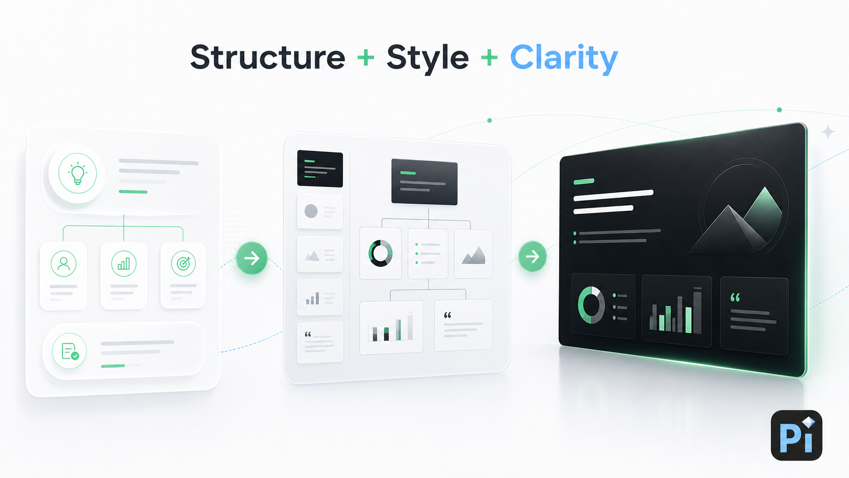
Pi is not just about applying a dark background. Its Multi-Agent AI supports the broader workflow: defining the argument, organizing the deck, shaping the visual system, and maintaining consistency across slides. That makes it useful for high-stakes workflows such as pitch decks, product launches, executive presentations, sales decks, and brand proposals.
1. Business Logic Comes Before Visual Mood
A dark presentation still needs a clear business story. If the structure is weak, a stylish background will not save it. The audience needs to understand the problem, opportunity, solution, proof, and next step.
Pi helps organize the presentation before visual styling takes over. This is especially important for investor decks and executive narratives, where every section must build toward a decision. The dark mode style becomes a way to reinforce the argument, not a substitute for it.
2. Premium Aesthetics Without Overdesign
Many dark slides fail because they try too hard. They rely on excessive glow effects, busy overlays, or decorative technology motifs that distract from the message. A business-ready dark presentation should feel sleek, but still controlled.
Pi’s aesthetic engine helps create dark background slides with professional restraint. The result can feel modern and polished without turning every page into a neon dashboard. That balance is important for teams that want a premium keynote presentation style while still sounding credible to investors, executives, or enterprise buyers.
3. Consistent Visual Hierarchy Across the Deck
Dark mode requires consistency. If one slide uses bright white headlines, another uses muted gray body text, and a third uses several competing accent colors, the deck quickly loses coherence. The audience may not notice the specific inconsistency, but they will feel that the presentation is less polished.
Pi helps maintain a consistent system for typography, spacing, contrast, emphasis, and pacing. This allows teams to build a full deck that feels unified rather than a collection of separate dark slides. For professional presentations, consistency is part of trust.
A Practical Verdict: Use Dark Mode When It Strengthens the Message
Dark mode is not a shortcut to better design. It is a strategic style choice. It works best when the presentation needs focus, atmosphere, premium positioning, or keynote-style drama. It works less well when the audience needs to process dense information quickly or review the deck like a document.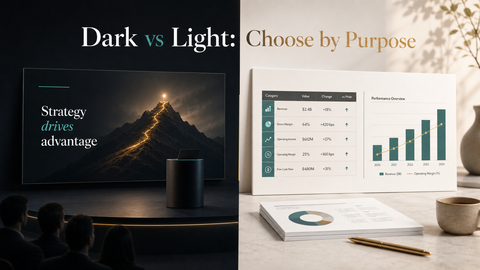
The best dark mode presentation is clear first and stylish second. It uses contrast to guide attention, spacing to reduce friction, and color to emphasize the right ideas. For teams creating high-stakes business presentations, Pi can help turn that discipline into a professional workflow where the message, structure, and visual tone work together.
Frequently Asked Questions (FAQ)
Q: What is a dark mode presentation? A: A dark mode presentation uses dark background slides, often with light text, controlled accents, and strong contrast. It is commonly used for modern pitch deck design, product launches, and keynote presentation style.
Q: Are dark background slides harder to read? A: They can be if contrast, font size, spacing, or projection conditions are weak. A strong dark mode presentation should use readable typography, clear hierarchy, and tested contrast for the actual viewing environment.
Q: Is dark mode good for investor pitch decks? A: Yes, when the pitch deck needs a premium, focused, technology-forward tone. However, dense financial slides or appendix pages may work better in a lighter style for readability.
Q: How does Pi help with dark mode presentation design? A: Pi helps structure the business story, apply premium visual quality, and maintain consistent hierarchy across the deck. Its Multi-Agent AI supports professional workflows where dark mode needs to look polished without sacrificing clarity.

 he Rise of Dark Mode: When and How to Use Dark Backgrounds in Presentations
 Generating Cohesive Visuals: Why It's Time to Ditch Cheesy Stock Photos