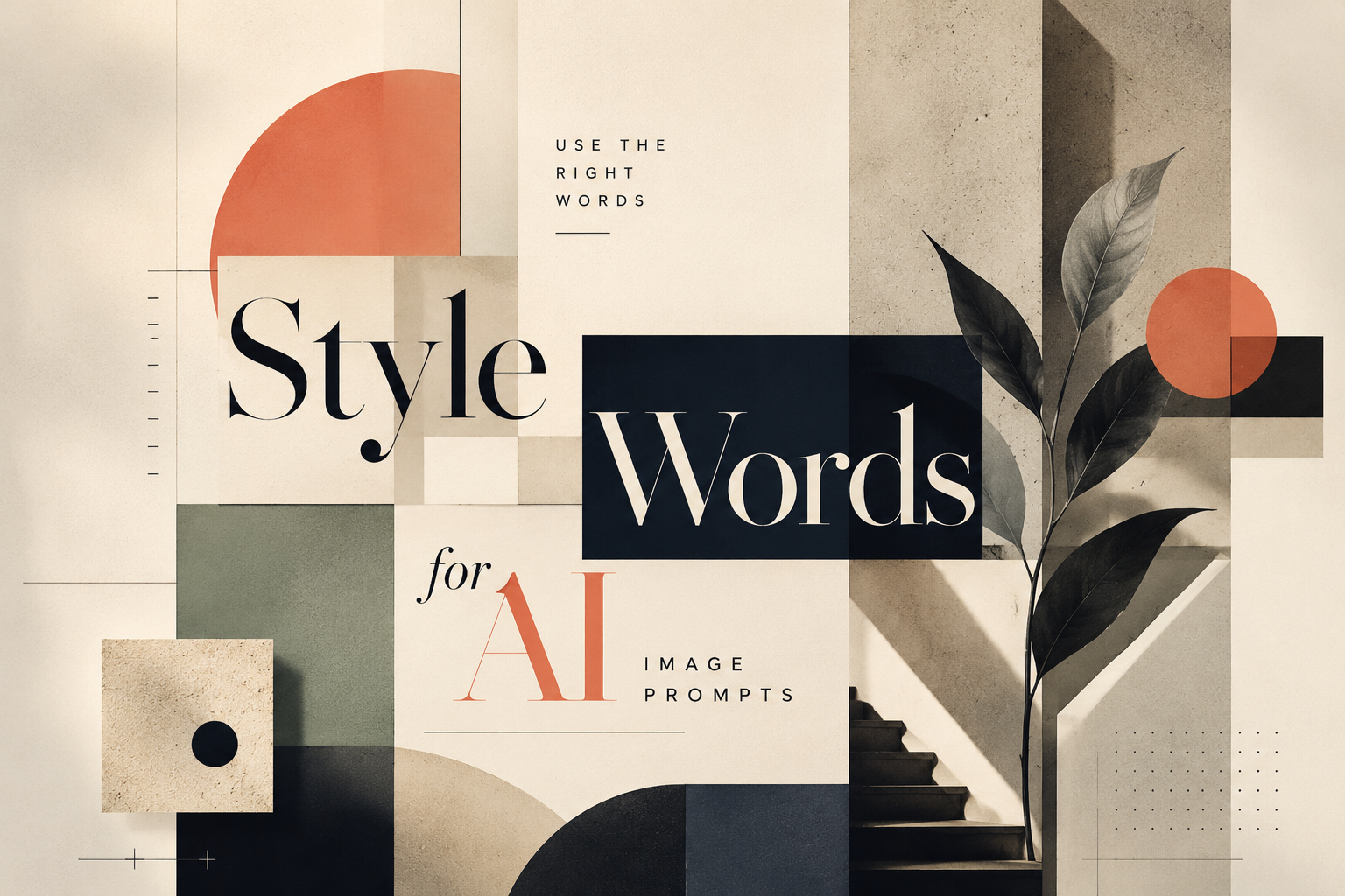
Useful Style Words for AI Image Prompts: How to Describe the Visual Style You Want
Many people know what kind of image they want, but they do not know how to describe it.
They may type:
- Make it look cool.
- Make it more premium.
- Make it cyberpunk.
- Make it modern.
- Make it warmer.
These prompts are not wrong. They point AI in a direction. But they are often too broad.
For example, “premium” could mean a luxury fashion ad, a clean consulting report, a soft editorial illustration, or a dark technology launch visual. “Cyberpunk” could mean neon city streets, holographic interfaces, chrome textures, digital rain, or a game-like character poster.
If you only give AI one style word, it has to guess the rest.
A better image prompt uses style words that describe the actual visual language: color, lighting, texture, composition, mood, and what should be avoided.
Instead of only saying:
Create a cyberpunk image.you can say:
Create a cyberpunk tech illustration with a dark futuristic city background, neon cyan and magenta lighting, holographic interface layers, digital rain, glowing grid lines, high-contrast composition, and cinematic lighting.The second prompt gives AI more visual anchors. It does not only name the style. It explains what that style should look like.
Below are five useful style directions you can use when generating images with AI.
1. Cyberpunk Tech Style
Cyberpunk tech style is useful when you want the image to feel futuristic, intense, and technology-driven.
It usually creates a darker visual world: neon lights, night cities, glowing screens, digital rain, holographic panels, and strong contrast. It works well when the topic needs a sense of future technology or dramatic digital energy.
Useful style words
cyberpunk, neon lighting, dark futuristic city, electric cyan, neon magenta, digital rain, holographic interface, glowing grid, high contrast, cinematic lighting, night city, chrome texture, cybernetic detailsWhat it usually creates
This style often produces images with deep black or dark navy backgrounds, bright cyan and magenta accents, futuristic city elements, glowing interface layers, and a strong cinematic mood.
It is good for:
- AI product concept visuals
- future technology covers
- data security images
- smart city visuals
- innovation campaign graphics
- technology event posters
It may not be ideal for calm, educational, medical, legal, or family-friendly content. Cyberpunk is visually loud. Use it when the topic can carry that intensity.
Copyable prompt
Create a 16:9 cinematic cyberpunk scene of a futuristic data control room overlooking a neon city at night. Use deep black and midnight navy shadows, electric cyan and neon magenta lighting, holographic interface panels, glowing data streams, reflective glass, subtle rain on the windows, and high-contrast cinematic lighting. The image should feel immersive, mature, futuristic, and technology-driven. No cute robots, no cartoon style, no office scene, no readable text, no logos.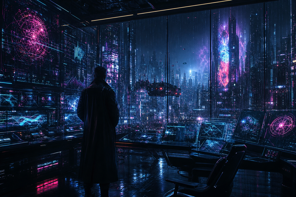
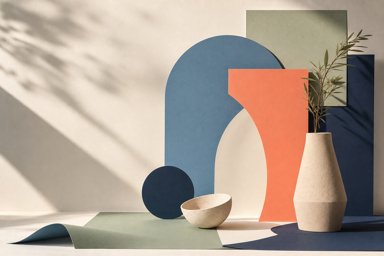
2. Minimal Editorial Style
Minimal editorial style is useful when you want an image to feel clean, intelligent, and modern without looking too corporate.
It is especially good for blog covers, abstract concept visuals, presentation images, product explainers, and knowledge-based content. Compared with cyberpunk, it is quieter. It relies on composition, spacing, shape, and color control instead of heavy effects.
Useful style words
minimal editorial, Swiss design, clean geometric layout, large negative space, warm off-white background, muted colors, paper-cut shapes, flat vector illustration, refined composition, modern magazine layout, subtle grain, structured gridWhat it usually creates
This style often produces images with large areas of negative space, clean geometric forms, paper-like layers, restrained colors, and a magazine-inspired layout. It feels designed, but not overdecorated.
It is good for:
- product concept illustrations
- thought leadership visuals
- method or framework articles
- abstract business ideas
- clean presentation backgrounds
If an image feels too “AI-generated,” minimal editorial words can help pull it back into a more restrained, designed look.
Copyable prompt
Create a 16:9 minimal editorial image featuring an abstract still life composition with layered paper forms, geometric sculptural objects, and soft architectural shadows. Use a warm off-white background, muted blue, coral, sage green, and deep navy accents, with clean geometric shapes, subtle paper-cut layering, refined balance, large negative space, soft natural light, gentle shadow transitions, and a premium magazine-style composition. The image should feel modern, calm, intelligent, and highly designed, like a sophisticated editorial visual or design magazine cover. Keep the composition visually rich enough to feel intentional, but not crowded. No people, no robots, no logos, no fake UI text, no product interface, and no busy background.
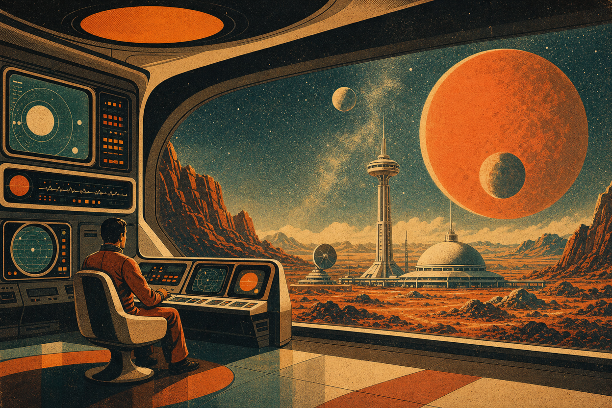
3. Retro Futurism Style
Retro futurism is useful when you want an image to feel both vintage and futuristic.
It looks like the future imagined from the past: old sci-fi posters, analog screens, faded colors, grainy print textures, space-age shapes, and optimistic technology. It has more personality than a standard tech visual, but it is less dark than cyberpunk.
Useful style words
retro futurism, 1970s sci-fi poster, vintage technology, grainy texture, warm orange, faded teal, bold geometric shapes, old computer interface, analog screen glow, space-age design, nostalgic future, halftone printWhat it usually creates
This style often produces warm orange and faded teal color palettes, old computer interfaces, geometric planets or orbits, print grain, halftone textures, and a nostalgic sci-fi mood.
It is good for:
- technology history visuals
- AI trend articles
- creative tech covers
- brand storytelling
- future-of-work content
- playful product concept images
Retro futurism is a good choice when you want something imaginative, but not too serious or too corporate.
Copyable prompt
Create a 16:9 retro futurism illustration of a 1970s-inspired space observation station on a distant planet. Use warm orange, faded teal, cream, and dark brown colors, bold geometric suns and planets, analog screen glow, old computer panels, halftone print texture, grainy poster texture, and nostalgic space-age composition. The image should feel vintage, imaginative, cinematic, and futuristic at the same time. No modern SaaS dashboard, no realistic office scene, no cute mascot, no glossy 3D style, no readable text.
4. Luxury Brand Style
Luxury brand style is useful when people say they want an image to feel “premium,” but need a more specific direction.
This style usually depends on restraint: elegant composition, soft lighting, rich materials, refined shadows, and fewer visual elements. It should feel polished, calm, and high-end, not crowded or flashy.
Useful style words
luxury brand style, elegant composition, premium magazine aesthetic, refined serif typography mood, black and gold palette, soft spotlight, marble texture, silk texture, minimalist product photography, high-end editorial, sophisticated shadowsWhat it usually creates
This style often produces black, gold, cream, champagne, or deep neutral palettes. The image may include soft spotlight effects, marble or silk textures, elegant shadows, and a high-end editorial feeling.
It is good for:
- brand research covers
- luxury product visuals
- fashion or beauty concepts
- premium business proposals
- high-end campaign images
- elegant social graphics
The danger is cheap gloss. If the image becomes too shiny, crowded, or artificial, add constraints such as “subtle,” “restrained,” and “no cheap glossy effects.”
Copyable prompt
Create a 16:9 luxury brand still life image featuring an abstract sculptural object on black marble and soft silk fabric. Use a black, champagne gold, and warm cream color palette, soft spotlight, refined shadows, subtle marble texture, silk-like folds, elegant negative space, and premium magazine-style composition. The image should feel high-end, calm, polished, tactile, and sophisticated. No neon colors, no cartoon elements, no crowded layout, no cheap glossy effects, no readable text, no logos.

5. Warm Educational Style
Warm educational style is useful when the image needs to make a topic feel easier to understand.
It works well for tutorials, training materials, user education, healthcare explainers, classroom visuals, and product onboarding. Instead of dramatic lighting or heavy effects, it uses soft color, rounded shapes, simple diagrams, and friendly visual rhythm.
Useful style words
warm educational, friendly illustration, soft pastel colors, rounded shapes, simple diagrams, clean icon system, approachable layout, calm visual rhythm, step-by-step explanation, hand-drawn warmth, light cream backgroundWhat it usually creates
This style often produces light cream backgrounds, soft pastel colors, rounded cards, simple icons, clear diagrams, and gentle visual flow. It feels less intimidating and more beginner-friendly.
It is good for:
- tutorial images
- user guide visuals
- training content
- medical education
- product feature explainers
- knowledge-sharing posts
Warm educational style is helpful when the topic is complex, but the audience needs clarity more than visual drama.
Copyable prompt
Create a 16:9 warm educational illustration of a quiet learning desk with open notebooks, simple diagram cards, soft stationery, a small plant, and warm natural light. Use a light cream background, soft pastel colors, rounded shapes, clean icon-like diagrams, gentle shadows, and an approachable editorial illustration style. The image should feel calm, clear, friendly, and easy to understand, suitable for tutorials or learning content. No realistic human faces, no crowded classroom, no dark mood, no dense charts, no tiny unreadable text, no logos.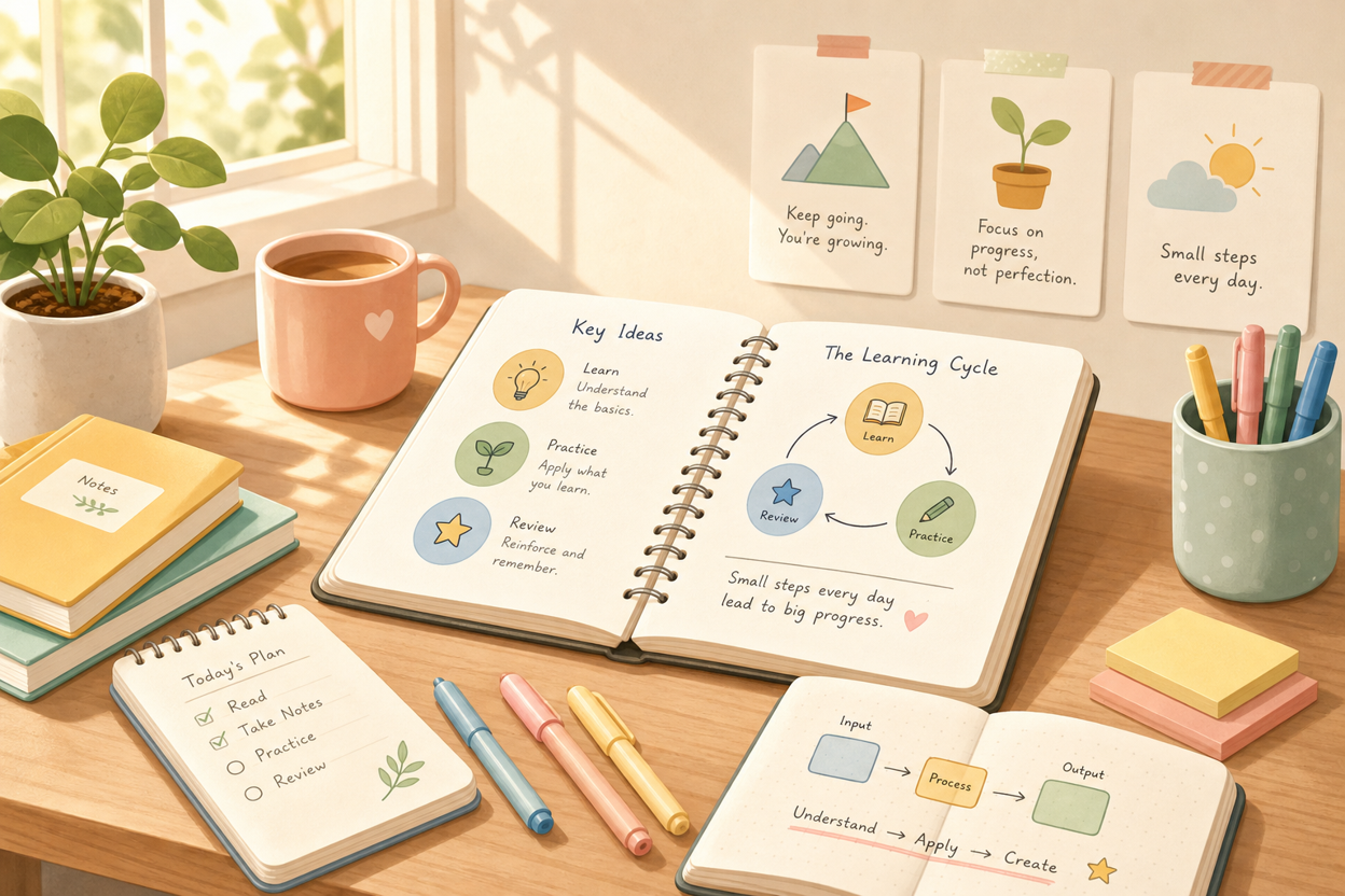

How to Combine Style Words in One Prompt
A good style prompt does not need to be long. But it should include more than a single adjective.
A simple formula is:
Style name + color palette + lighting + composition + texture + visual elements + avoid wordsFor example:
Cyberpunk tech style + neon cyan and magenta + cinematic lighting + dark city composition + holographic texture + digital rain + avoid cute robotsOr:
Minimal editorial style + warm off-white background + soft shadows + clean geometric composition + paper-cut texture + abstract slide cards + avoid fake UI textYou can turn that into a complete prompt:
Create a minimal editorial illustration with a warm off-white background, soft shadows, clean geometric composition, paper-cut textures, abstract slide cards, and muted blue and coral accents. The image should feel modern, calm, and intelligent. Avoid fake UI text, logos, photorealistic people, and crowded backgrounds.This structure gives AI a clearer visual map. It tells the model not only what style you want, but what that style is made of.
Useful Avoid Words
The “avoid” part of the prompt is often just as important as the style words.
When generating images, you may want to add constraints like:
no text, no logo, no watermark, no fake UI words, no realistic human faces, no crowded dashboard, no stock photo style, no excessive glow, no blurry details, no cartoon mascotYou do not need all of them every time. Choose the ones that match your use case.
For example, if you are creating a blog cover, “no text” and “no logo” may be important because you will add the title later. If you are creating a professional business visual, “no cartoon mascot” and “no crowded dashboard” may help keep the result more polished.
Final Thought: Describe the Visual Language, Not Just the Vibe
Words like “cool,” “premium,” “modern,” and “beautiful” can help, but they are not enough on their own.
The more useful question is:
What makes this image look that way?
Cyberpunk is not just “cool.” It is neon lighting, dark city atmosphere, holographic interfaces, and high contrast.
Luxury is not just “premium.” It is elegant spacing, refined shadows, soft spotlight, and restrained materials.
Educational is not just “friendly.” It is soft colors, rounded shapes, simple diagrams, and an approachable layout.
When you describe the visual language behind the style, AI has less guessing to do.
That is how you move from a vague image idea to a result that actually matches the style in your head.
 Corporate Employee Onboarding Presentation: Engaging Internal Training Templates
